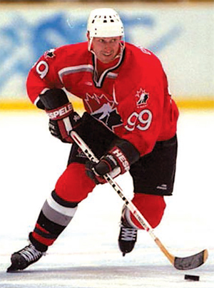
All saw the symbols of the current Ice Hockey World Championship. The image of a player with a hockey stick could be found practically everywhere: on posters, billboards, clothes, souvenirs and other holiday attributes. But very few people knew that the basis of the logo of the World Championship 2014, was the photo of a world hockey legend with Belarusian roots, Wayne Gretzky. Designer, Victoria Adamovich told how and why it happened so.
“Everything started in 2008, when the Hockey Federation of Belarus announced the competition for the best logo,” Victoria recollects. “My colleagues at work told me to try!
The concise sign of the Minsk designer was chosen from more than 200 competition entries and, 500 days before the beginning of world tournament, T-shirts, caps, badges, magnets, sticks and other souvenirs with a picture in the colours of the national flag, appeared on the shelves of the shops.
What do you feel, when your creation is now everywhere?
It is not the first time I have seen the result of my work on shop shelves. It is my job. Every day we draw labels for totally different products. Ice-cream, marshmallow, cookies… Recently, when I was at the cinema I ate popcorn from a glass, the design of which I thought up myself. But the feeling which I have now is really special. I feel a great pleasure from my personal involvement in such an event.
Do you want to return to 2008 to change anything in the design of the logo?
I recently drove by Independence Square. There is a huge image of my ‘hockey player’. I examined it once again, and I can say that I like everything in it!
 Victoria started to look over folders in a bookcase. “I search for ‘brand-book’, to show you,” explained the designer.
It appears that the symbol of the championship had to meet a list of the strictest requirements. And it is difficult to call it just a list of standards; it is almost a whole book. I open it. The instructions are completely in English.
“Naturally, the drawing should be positive. But there are many technical points. For example, the abbreviation IIHF should be only white in colour and should be located on a certain line, while the colour of the space around it can be chosen by the country-organiser.”
I look carefully through other requirements for a logo. A picture is extensively lined by dashes, it is like a visual manual for a designer. It also contains an invariable place of inscription ‘World Championship’, its obligatory black colour and ‘Arial’ font, while the name of the country can be designed to taste. Every trifle is specified, there is no graphic element that can run beyond the rated limits.
“I examined the instruction and began to think over the image and colour of a logo,” Victoria recollects. “I at once decided that red would dominate!”
The designer chose the colour in order to underline the strength and energy of the sport. Green is the original image of life in all its displays. White ice speaks to us of firmness and cleanliness.
“The white colour is associatively connected with the concept Belaya Rus (White Rus). I used the colours of the Belarusian flag. After all, the logo of the World Championship should have national value,” Victoria adds.
She at once conceived to place the image of a courageous player into the basis of a symbol and began to search for a suitable figure.
“I have an amusing story which is connected with it,” Victoria says. “Seemingly, my plan was absolutely simple: to draw a hockey player, who was strong and brave, and visually, as if he was coming towards you. It means that he is not turned to the right or to the left, but as if he always rushes forward. So I wanted to represent freedom and aspiration to open new horizons.”
The designer tells, that in her search for a necessary figure, she sat at the computer and started searching on the Internet by simply typing ‘hockey player’.
“Well, I am a girl,” smiles Victoria. “And I have never followed world sports. I do not know the surnames of eminent hockey players. They were all alike for me.”
As a result, she chose a photo where she found what she wanted: power, strength and a beautiful silhouette of a hockey player who crosses the ice after a puck.
“I liked this photo; I was inspired by it and drew a silhouette of a player. I made it according to all the rules and then sent to the competition. I was very happy that my work was chosen. This process was not fast. After all together with the ready picture it was necessary to send all accompanying materials for co-ordination with the IIHF. I even had to send the photo of the person whose silhouette I used as the basis of the work.”

Wayne Gretzky in the logo
After some time Victoria had a call ‘It is good that you chose Wayne Gretzky!’ At that time she did not understand that absolutely casually, and maybe intuitively, she had depicted a hockey legend. The organising committee simply saw the unique number 99 on the designer’s photo, which is considered the calling card of the eminent sportsman. Thus they recognised the star.
“It was said that when Gretzky came to the opening of Minsk-Arena in 2010, he was shown the future symbol of the championship,” Victoria recollects.
Together with the designer, we decided to find that image. It appears that the picture was made on February, 14th, 1998, during the Winter Olympic Games in Nagano. On the photo Gretzky propels a puck in the game against Sweden. By the way, the Canadians won the match at that time.
Since designing the logo, the designer, of course, has not become an ardent fan of hockey, but she, together with her family, willingly visited the Minsk-Arena. She lost her voice as she screamed, together with others, during the match, raised a wave of support and was filled by a sports passion which she has never experienced before.


